The Microsoft 365 Admin Center is a portal where businesses manage subscriptions and billing for their M365 services. I redesigned its delete payment method experience to guide users through blockers, improve completion rates, and reduce support burden.
Lead Designer
Nov 2024 — Apr 2025
UXR, Product, Engineering
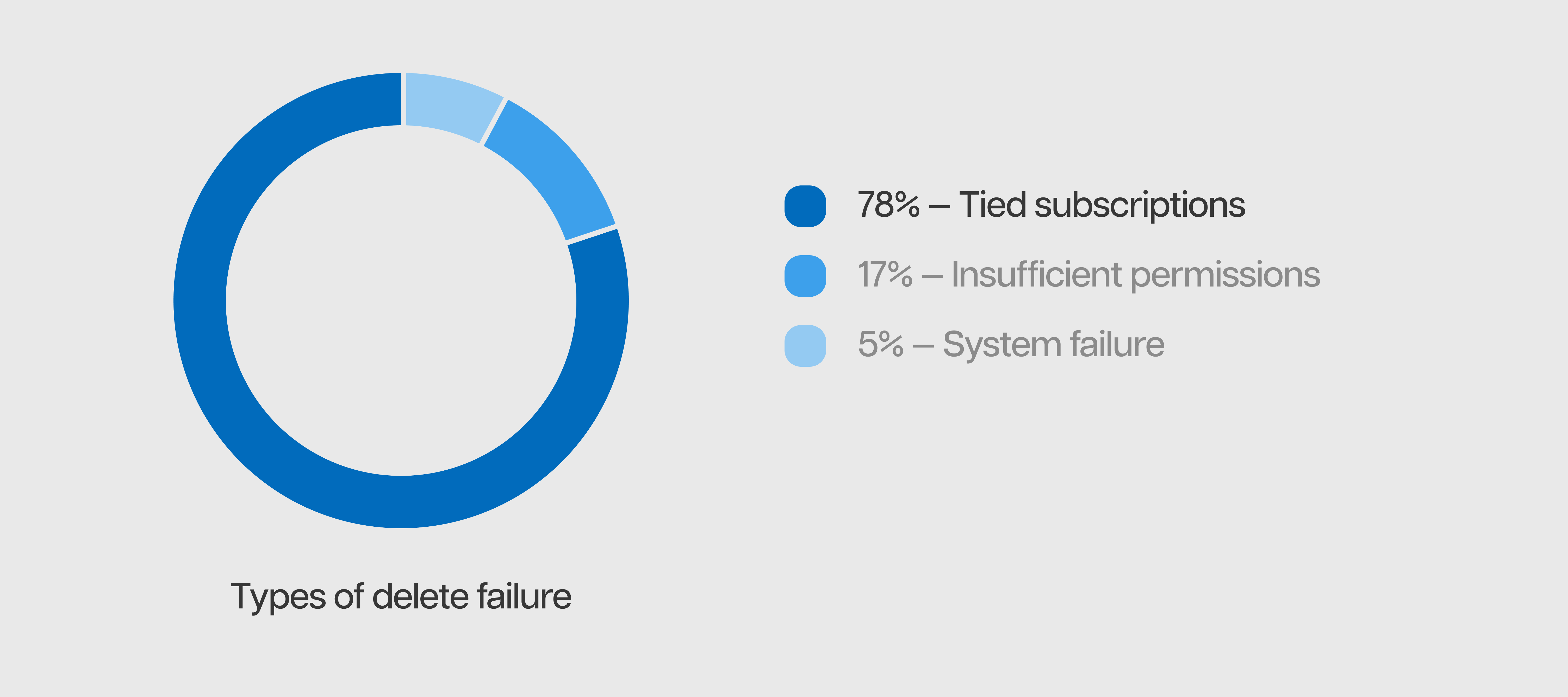
40% of total delete attempts failed, making it consistently the top support driver in M365 billing.
To better understand why delete actions failed, I partnered with our research team to analyze available telemetry. We found that most failures occurred when users tried to delete a payment method still tied to active subscriptions — this became the project's focus.
Upon identifying the key failure scenario, I audited the existing experience of deleting a card tied to subscriptions, and uncovered several usability issues:
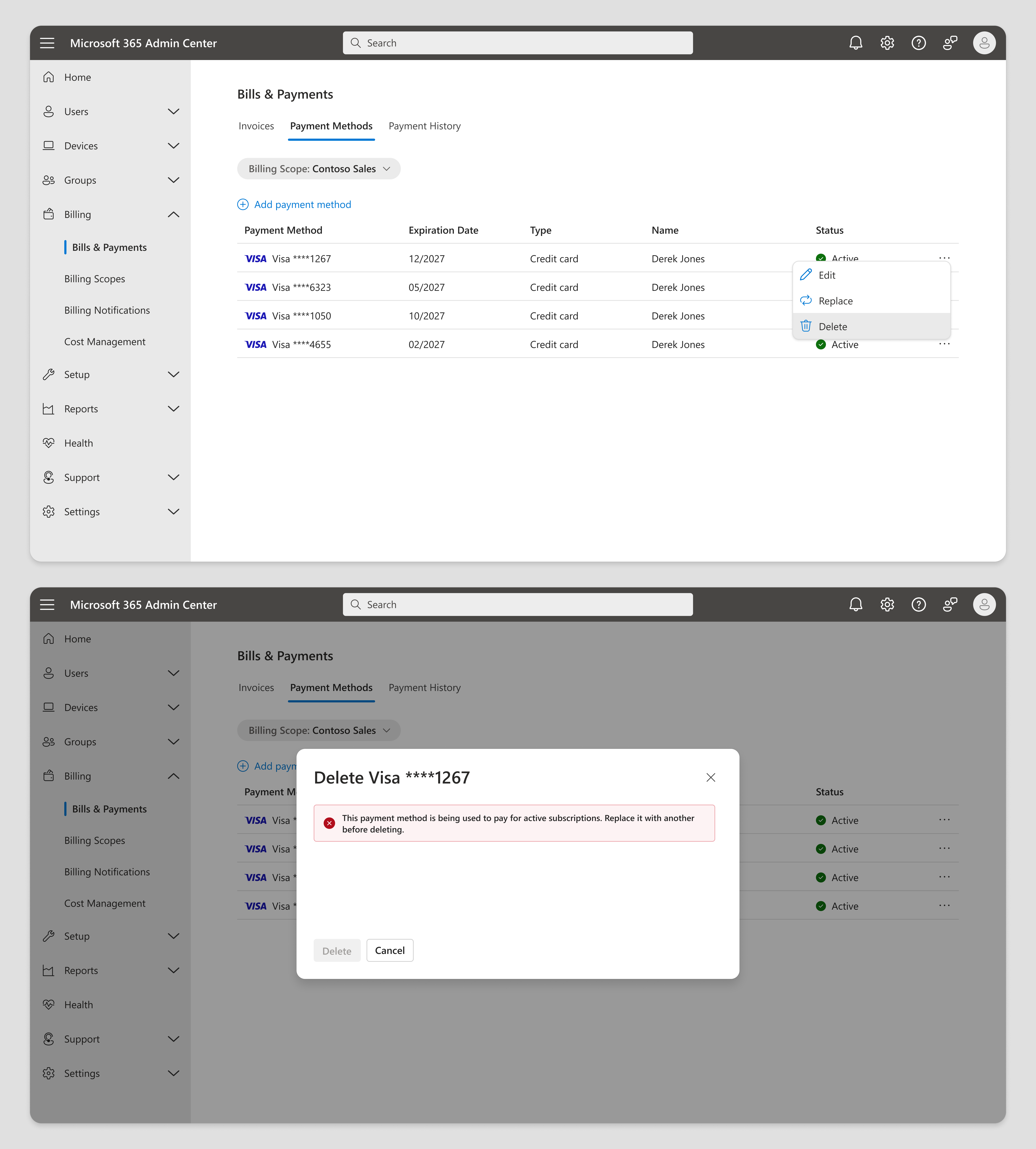
Misleading error
Even though user hasn't taken an invalid action.
Missing context
About which subscriptions are blocking deletion.
No recovery path
To replace the card or manage subscriptions.
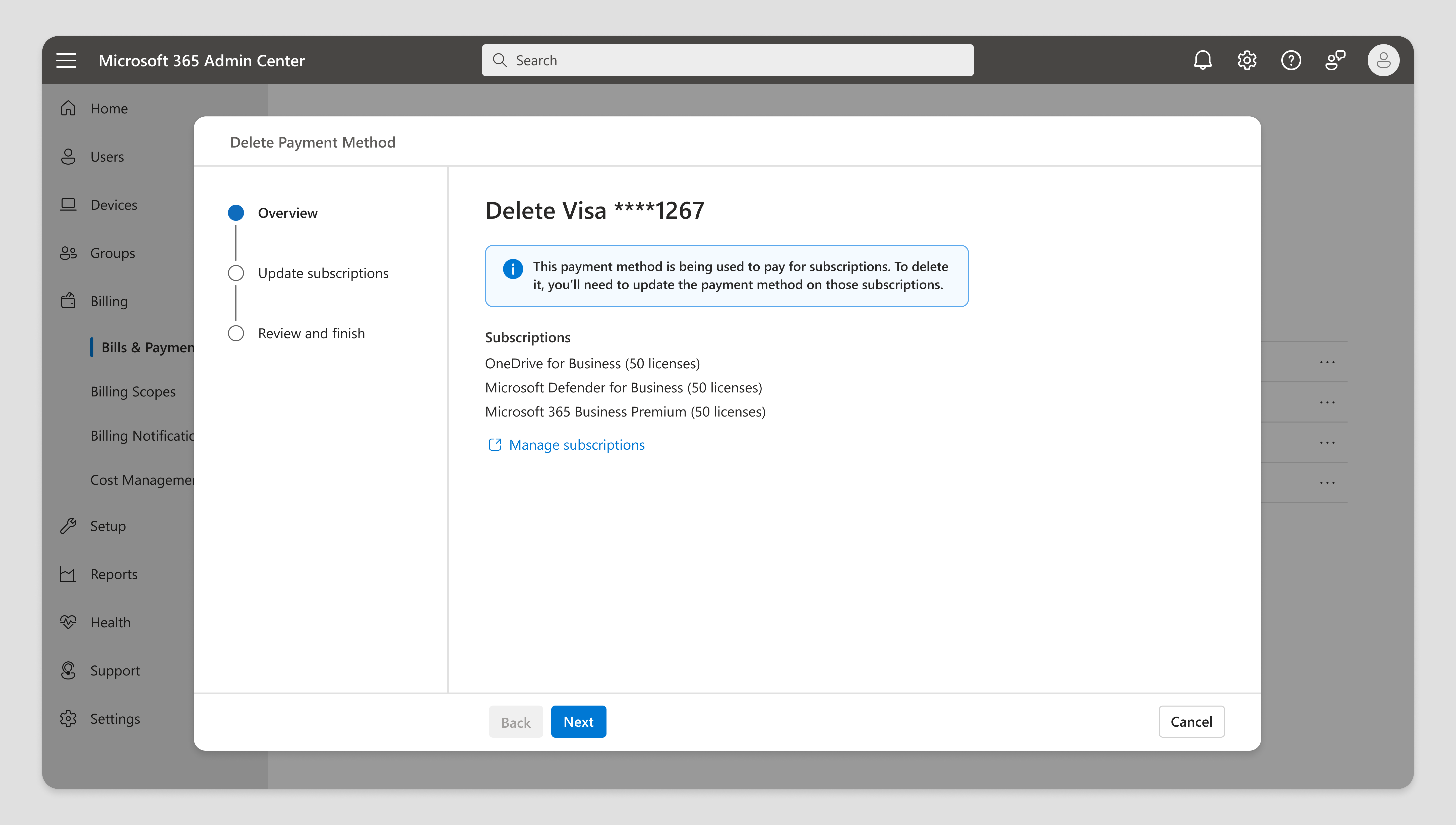
I initially explored moving the experience from a dialog to a step-by-step wizard for added guidance, but decided the flow wasn’t complex enough to warrant it, and the extra steps added unnecessary friction. I decided to keep the existing dialog experience.
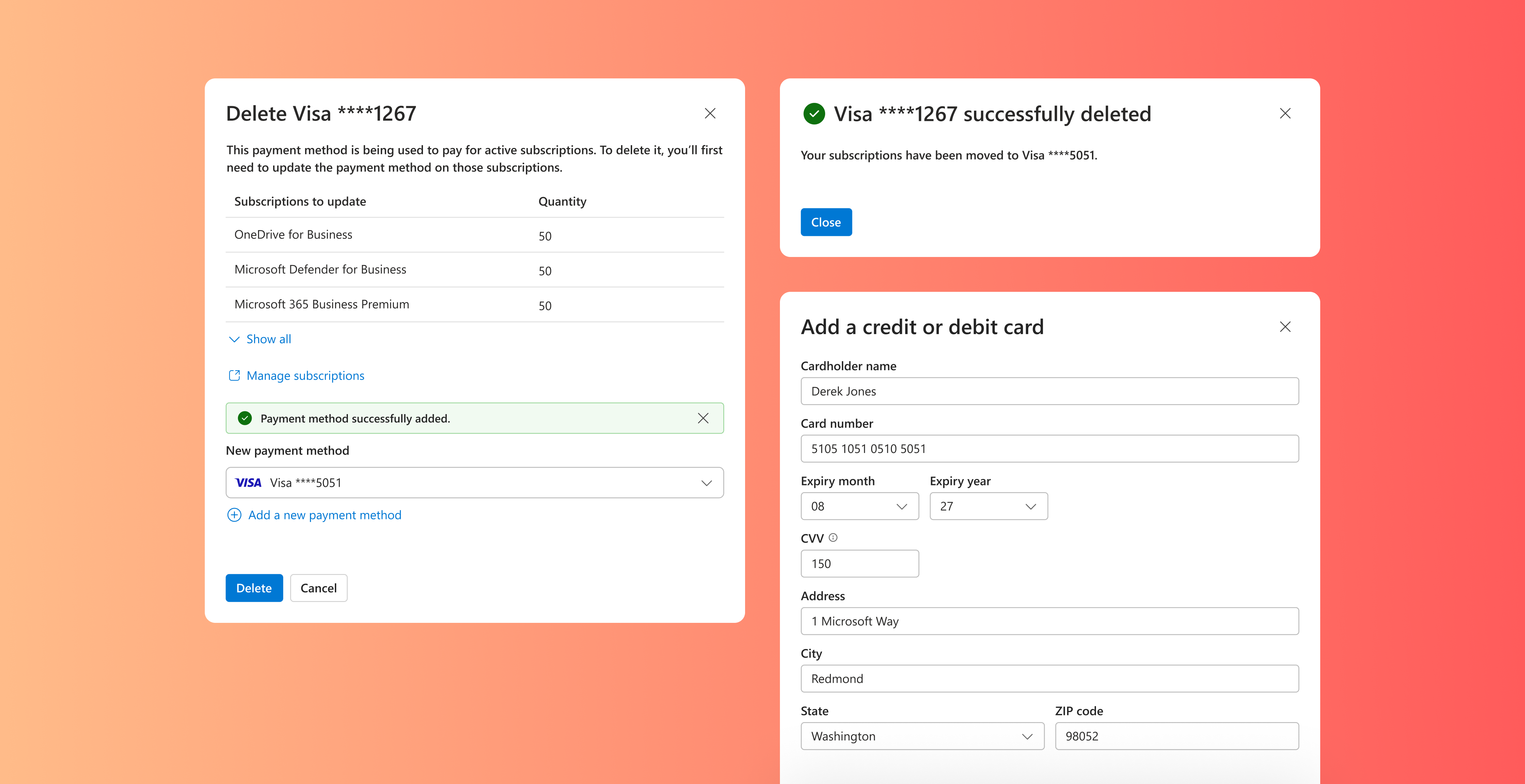
Upon pivoting back to a dialog, I swapped the original error banner for an informational one with next-steps guidance. I added a “Manage subscriptions” CTA for users closing their account, and a “New payment method” section to let users update subscriptions with a saved card or by adding a new one. Design review surfaced two main pieces of feedback:
Banner is visually disconnected
Sits apart from key content, making it easy for users to overlook or miss.
Subscriptions list is overwhelming
Difficult to scan when many items shown; consider collapasing long lists.
My final design retains the core elements of the initial version, while refining them based on design review feedback.
Inline messaging explains what’s blocking delete and next steps.
Subscriptions list presented in a data grid; auto-collapsed if long.
"Manage" CTA lets users cancel tied subscriptions/close their account.
Built-in flow to update subscriptions by using a saved or new card.
By removing error blocks and embedding subscription update actions, users can resolve delete issues on their own. This has greatly reduced support volume within M365 billing.
30% decrease
in monthly billing support volume
80% increase
in successful delete attempts
01 — Guide users to resolution
This project showed that simply informing users of a problem, like blocking delete, isn’t sufficient. To create a truly supportive experience, it needs to guide users to resolve the issue with embedded actionable next steps, not just display an error.
02 — Don't neglect edge cases
It also reinforced the importance of designing for edge cases, not just the happy path. The original flow treated blocked deletes as exceptions, but they made up nearly half of all delete attempts. Good design accounts for every path and ensures each feels guided and supported.